What makes a brand different from others? What do you imagine when I say NIKE, ADIDAS, STARBUCKS, or Zara? The visual cornerstone of any successful company is its logo design, a silent ambassador that speaks volumes about its values, mission, and target audience. Imagine scrolling through a crowded social media feed—a well-designed logo can be the difference between a brand getting lost in the noise or sparking instant recognition.
This blog post by NOS Digital’s team of passionate designers, dedicated to designing logos that empower brands, will delve into the fascinating world of logo design. We’ll explore the purpose of a logo, the key elements of a successful design, and the step-by-step process for bringing your Brand’s visual identity to life.
Why Logos Matter
Think of the iconic swoosh of Nike or the bitten apple of Apple. These logos exceed mere aesthetics; they’re instantly recognizable symbols that bottle the essence of the Brand. A well-designed logo serves several critical functions:
- Brand Recognition: A logo is the face of your company, acting as the first point of contact with potential customers. A memorable and distinctive logo fosters brand recognition, making it easier for customers to recall your Brand later.
- Brand Identity: Logos visually communicate a brand’s core values and personality. Think of the bold, dynamic lines of the FedEx logo design conveying speed and reliability or the elegant script of Chanel symbolising luxury and sophistication.
- Brand Differentiation: A strong logo sets you apart from the competition. A unique and memorable logo in a crowded marketplace helps your Brand stand out and capture attention.
Types of Logos
There are several types of logo design, each with its unique characteristics:
- Wordmarks (Logotypes): These logos contain the company name in a unique typeface (e.g., Google).
- Letter marks (Monogram Logos): These use the company’s initials (e.g., IBM).
- Brand Marks (Symbol or Icon): A symbol or icon represents the brand (e.g., Apple).
- Combination Marks: These combine a symbol and a wordmark (e.g., Adidas).
- Emblems: The text is enclosed within a symbol or icon (e.g., Starbucks).

The Anatomy of a Great Design
Creating a logo that resonates with your target audience requires careful consideration of several key elements, such as:
- Simplicity: Simple logo design is easily recognizable and adaptable across mediums, from business cards to billboards. Think of McDonald’s golden arches – instantly recognizable in any size or colour.
- Memorable: A great logo leaves a lasting impression. It should be visually engaging and easy to recall, even after a single viewing. The Target Bullseye logo is a prime example – simple, memorable, and instantly associated with the brand.
- Timeless: Avoid trendy designs that may become outdated quickly. Opt for a classic and timeless look that endures, like the Coca-Cola logo, which has remained unchanged for over a century.
- Versatile: Your logo should look good in various applications – on websites, printed materials, and even embroidered on clothing. The Starbucks logo is a great example – it translates smoothly from a tiny coffee cup on a sleeve to a giant billboard.
Tools and Resources for Logo Design
Want to create amazing logos? Here are some tools and resources to help you on your logo design journey:
- Software: Adobe Illustrator, Canva, Sketch
- Online resources: Design blogs, tutorials on YouTube, and forums like Behance and Dribble
- Books: “Logo Design Love” by David Airey, “Identity Designed” by David Airey, and “Logo Modernism” by Jens Müller
From Sketch to Symbol: The Process of Logo Design
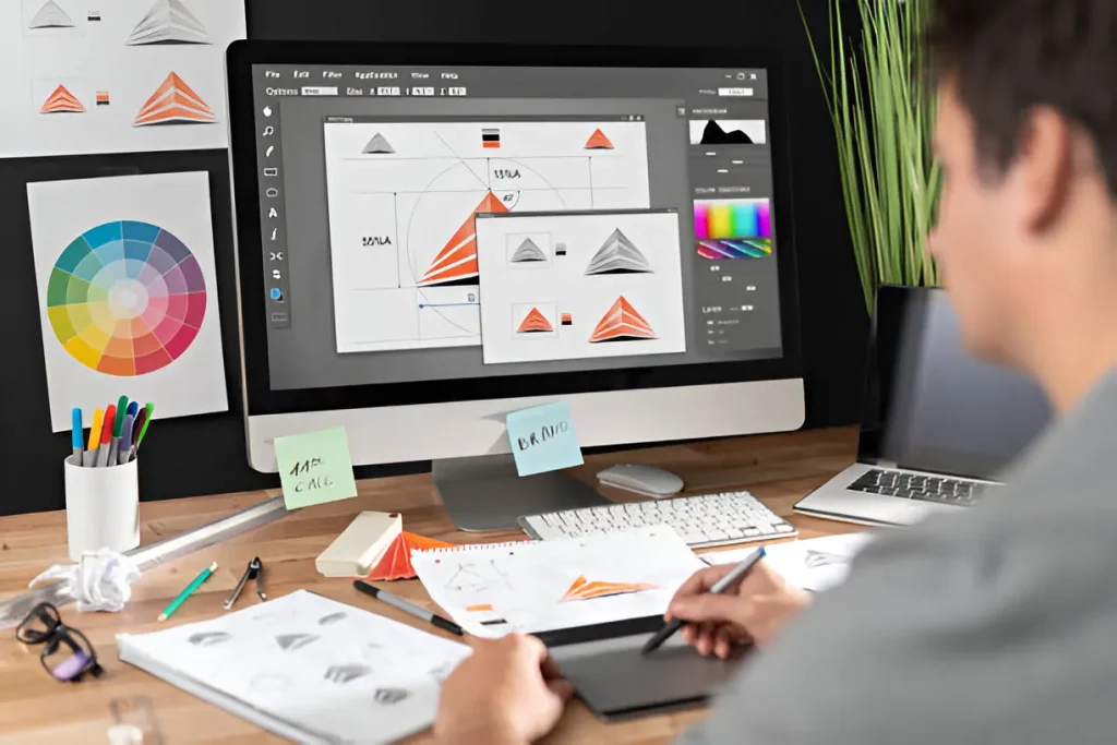
Creating a powerful logo is a collaborative journey which involves many key stages. Here’s a breakdown:
- Research & Brainstorming:
- Research the client’s mission, values, and target audience to understand the Brand.
- Competitive Analysis of competitor logos to identify trends and opportunities for differentiation.
- Target Audience Research to know the preferences and expectations of the client’s target demographic.
- Conceptualisation:
- Start with rough sketches to explore different design concepts.
- Develop digital drafts of the most promising logo ideas.
- Refinement:
- Choose the most promising logo design for further development.
- Polish the selected designs, focusing on colour, shape, and font.
- Share the designs with the client and stakeholders to gather valuable feedback.
- Finalisation:
- Select a colour palette and typography that complement the design and brand identity.
- Prepare logo versions in black & white, full colour, and various sizes to ensure versatility.
Dissection of Famous Logo Design and the Psychology Behind Them
Let’s examine successful logo design and understand the psychology behind how these visual icons speak to our subconscious mind.
- Amazon’s Smile:
- Symbolism: The arrow shaped like a smile subtly points from “A” to “Z,” cleverly conveying Amazon’s vast product selection; they have everything from A to Z (and everything in between) to fulfil customer’s needs.
- Psychology: The upward-turning smile evokes a sense of happiness, satisfaction, and possibility, making customers feel good about shopping on Amazon.
- FedEx Logo: The Hidden Arrow
- Symbolism: At first glance, the FedEx logo appears to be simply the company name in boldface. However, a closer look reveals a cleverly hidden arrow formed between the “E” and “x.” This subtle arrow symbolises speed, precision, and forward momentum, all qualities on which FedEx prides itself.
- Psychology: The hidden arrow uses negative space to create intrigue and a sense of discovery, subconsciously reinforcing the idea of FedEx’s efficient delivery solutions.
- Airbnb’s Friendly Colour Embrace
- Symbolism: The Airbnb logo uses a friendly and approachable colour palette. The red half represents a place to stay (think of a red roof), while the blue half symbolises a person or traveller (think of a blue globe or map marker).
- Psychology: Red is associated with warmth, comfort, and home, while blue evokes feelings of trust, security, and reliability. This colour combination creates a welcoming and inviting feeling, perfectly aligning with Airbnb’s mission of connecting people with unique homes worldwide.
These are just a few examples of how logos can be powerful tools for influencing consumer perception. By understanding the psychology behind colour, shapes, and symbols, designers can craft logos that resonate with the target audience and leave a lasting impression.
Want a perfectly designed logo for your Brand? Contact us today for a free consultation of logo design services! We’ll work closely with you to understand your Brand’s identity and vision and craft a professional business logo that will hook your target audience.

