Did you know that poorly designed dashboards cost businesses millions of dollars each year in lost productivity and missed opportunities? Effective dashboard development is the nerve centre of data-driven decision making, but cluttered interfaces and irrelevant information can leave users frustrated and confused.
An effective dashboard designing and development service is more than just a collection of charts and graphs; it’s a strategic tool that needs careful planning and thoughtful design. It should present data in a clear, concise, and meaningful way, according to the specific needs of its users.
In this blog, NOS Digital will guide you on how to develop user friendly dashboards designs. By avoiding some common mistakes, you can create dashboards that save time, and improve decision-making but also contribute to a more efficient and productive work environment.
Read More About: Dashboard Designs: Essential Strategies and Guidelines in Dubai, UAE
What is a Dashboard?
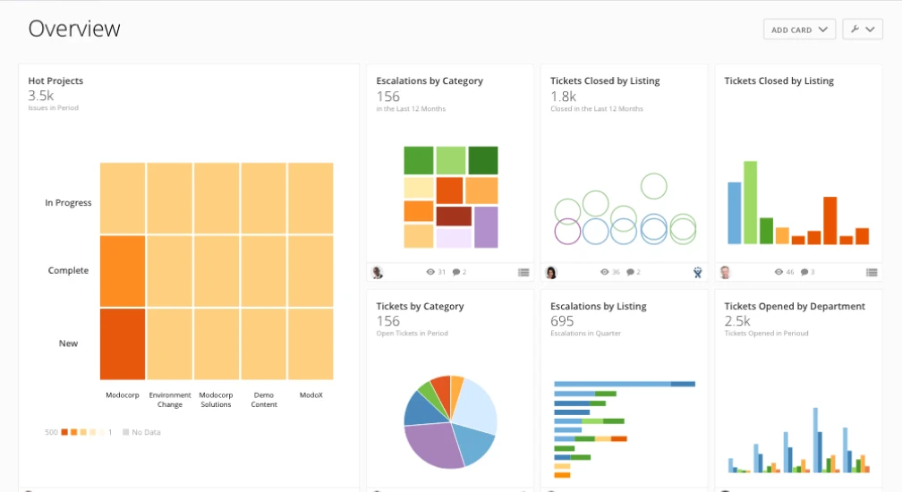
A dashboard is a visual tool that displays key performance indicators (KPIs) at a glance. It uses charts, graphs, and other elements to help users see patterns, trends, and outliers that might not be obvious otherwise. Dashboards help users to:
- Save time by quickly spotting issues.
- Make better decisions with key information readily available.
- Clearly communicate information to others.
- Track progress and identify areas for improvement.
Read More About: Corporate Web Design and Development Agency in Dubai, UAE
7 Mistakes to Avoid In Dashboard Development and Design in Dubai, UAE
Now that you understand the power of dashboards, let’s dive into the mistakes that can fail your development project:
1- Ignoring Your Target Audience:
Many dashboard development designs fail because they try to please everyone. This “one-size-fits-all” approach leaves users confused and frustrated. Imagine an executive needing a quick snapshot of sales trends versus an analyst who needs to see into specific product performance. Their information needs are majorly different.
Solution: Know Your Audience
Instead of designing in a vacuum, take the time to understand your target audience. Create user personas that outline the specific roles, goals, and tasks of your target users. This helps you develop the dashboard according to their unique needs, resulting in an impactful experience.
2- Skipping Storyboarding in Dashboard Development Design in United Arab Emirates:
Imagine starting a road trip without a map or destination in mind. That’s essentially what happens when you skip storyboarding your dashboard. Without a clear plan, development becomes a guessing game, leading to confusion, wasted time, and features that miss the mark.
Solution: Charting Your Course
Storyboarding is a process where key players like users, developers, and project managers come together to define:
- The dashboard’s purpose: What problem are we trying to solve?
- User flow: How will users navigate and interact with the dashboard?
- Data requirements: What information is needed to achieve the desired outcome?
Think of storyboarding as a chance to iron out the wrinkles before any code is written, saving time and frustration down the line.
Read More About: Marketplace Website Development & Design Company In Dubai, UAE
3- Wireframing:
Flashy, colourful prototypes might seem impressive at first glance, but for wireframing your dashboard, simplicity is key. Think of a wireframe as a blueprint, it defines the foundation of the dashboard design and development, not the final decoration.
Solution: Focus on Functionality
Instead of focussing aesthetics, use wireframing tools to create a basic layout that prioritises two crucial aspects:
- Data Hierarchy
- User Flow
By focusing on these elements with grayscale and strategic use of white space, you can create a wireframe that’s clear, functional, and effectively communicates the core structure of your dashboard.
4- Data Without Context:
Imagine looking at a speedometer without knowing the speed limit. The numbers alone wouldn’t tell you if you’re driving safely. The same principle applies to dashboards. Data without context can be confusing and misleading.
Solution: Enrich Data with Meaning
To make your dashboard insightful, provide context around the data. This could include:
- Benchmarks
- Historical Data
- Comparisons
5- Using Too Many Colours in Dashboard Development Design:
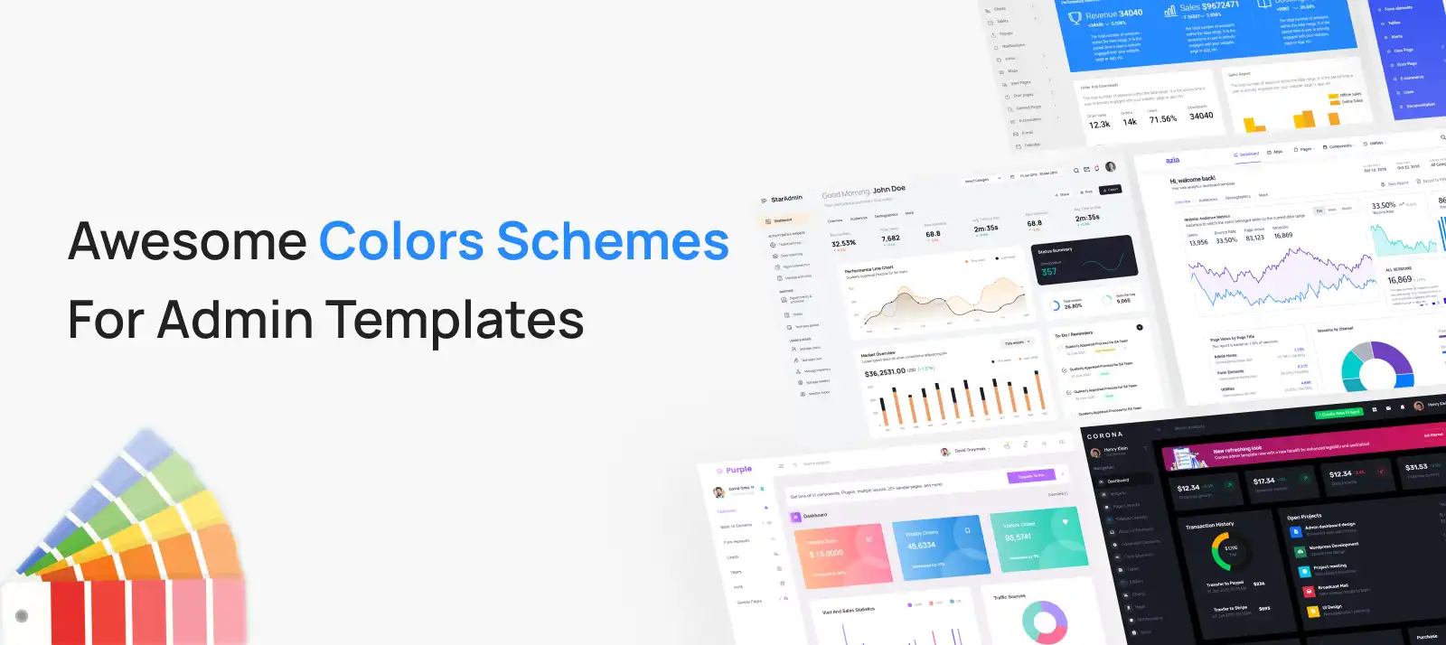
Imagine a dashboard exploding with rainbow colours. While a vibrant palette might seem exciting, it can quickly overwhelm users and make it difficult to distinguish between important data points.
Solution: Use Colours for Clarity
Think of your dashboard’s colour scheme as a guide. Here’s how to create a colour palette that improve clarity:
- Stick to a maximum of 3-5 core colours.
- Opt for neutral or muted tones for the background and primary information areas in dashboard development design. These colours recede visually, while allowing data to take centre stage.
- Reserve brighter colours for highlighting key elements or drawing attention to specific trends or outliers. This creates a visual hierarchy and helps users focus on what matters most.
6- Information Overload:
Don’t bombard users with every detail at once. Prioritise the most critical information for each user role and decision-making step. Less is often more when it comes to effective dashboard development design.
Solution: User Testing For Balance
Conduct user testing to determine the optimal level of detail for different user roles.Here’s how to achieve the perfect balance:
- Focus on User Roles, What information does each user type need to perform their job effectively?
- Consider the different decisions users make while interacting with the dashboard. What data is essential for each decision?
7- Alert Overload:
Too many alerts can create confusion and dilute the impact of truly important notifications. Reserve alerts for situations requiring immediate action. If everything is flagged as important, then nothing truly stands out.
Solution: Prioritise Actionable Insights
The key to effective alerts lies in using them strategically. Partner with your users to identify the most critical metrics that require immediate action. Alerts should also serve as a trigger to take corrective measures or capitalise on opportunities.
Read More About: Ecommerce Design and Development Company in Dubai, UAE
Conclusion:
By avoiding these common dashboard development mistakes, you can offer dashboard designing services that empower users, streamline decision-making, and drive organisational success. Remember, every dashboard serves a unique purpose. By focusing on user needs and prioritising clear communication of data insights, your dashboard development services can deliver a positive return on investment.


